Two maps explain the racial history behind Alabama’s senate vote
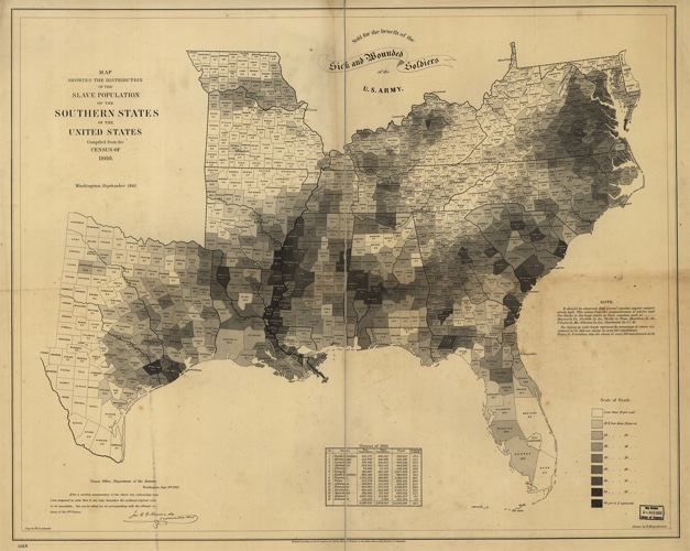
This 1860 map from the US Census (pdf)–a beautiful relic of a horrible part of US history–shows the distribution of slavery in the South. It was made to raise money for sick and wounded soldiers of the army. And while correlation is not causation, there is a startling visual parallel when you zoom in to Alabama on the map and compare it to how Alabama just voted this week.