About that new “study” that supposedly vindicates Piketty…
tags: Phillip W. Magness,Thomas Piketty,Saez-Zucman
Robert Murphy has an excellent post up today following a conversation about the new Saez-Zucman (2014) “study” of US wealth inequality that Piketty is currently trumpeting (see p. 7) as something of a vindication of his highly problematic and as-of-yet still unexplained Figure 10.5.
The first takeaway is that Saez-Zucman (2014) isn’t really a study – it’s a PowerPoint slideshow of a working project that has yet to be peer reviewed, yet to be published, and – as far as I can tell – isn’t even in a working paper format yet on SSRN or a similar content-sharing venue. Note that this isn’t necessarily a knock against Saez-Zucman. It only means that their new estimate is still very much a work in progress. Its data are not yet available for independent scrutiny, and its methodology – which the authors tout as a new alternative to other estimates of the same trend – is only vaguely outlined in bullet point format. I’m genuinely curious to see what the final product of Saez-Zucman looks like, but this is hardly the stuff of a conclusive peer-reviewed citation-worthy source. And if anything, Piketty’s use of it in this manner smacks of the type of people who try to pass off “working papers” as publications on their academic CVs.
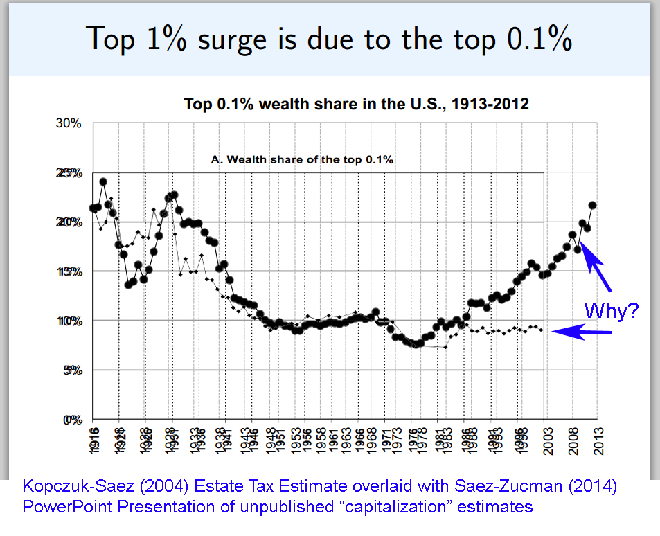
That duly noted, I am actually more intrigued by the second part of Murphy’s post where he notices something very interesting about the graphs on the Saez-Zucman PowerPoint. Since it is only a PowerPoint, we don’t yet have the actual numbers for their estimates. But we do have this older Kopczuk-Saez study from 2004, which was peer reviewed and which uses an estate tax-based estimate (note: this is the same study that provides most of the underlying data for Piketty’s Figure 10.5, but from which Piketty’s trend lines greatly diverge due to his habit of switching between other supplemental sources). As Murphy points out, the graph from the Saez-Zucman (2014) PowerPoint actually closely follows the published and peer reviewed estate tax estimate of Kopczuk-Saez (2004) until the early 1980s.
Then they suddenly diverge. And what’s important is the divergence is extreme.
Since it is impossible to know the exact root of this divergence without being able to examine the Saez-Zucman (2014) data and methodology, we have to speculate as to its cause (and Murphy has a plausible theory to this end as well – the 2014 PowerPoint graph’s figures are drawn from a capitalization technique that may be severely overstating its post-1980s asset value estimates by mishandling a decline in interest rates).
One thing is certain though: the 2004 estate tax estimate does seem to reliably parallel the Saez-Zucman PowerPoint’s estimates using a different technique prior to the early 1980s, which suggests the initial accuracy of the two estimates before something goes completely haywire in one or both. Using the Saez-Zucman (2014) PowerPoint – which is again all that we have to go by – I did my best to overlay the 2004 Kopczuk-Saez graph of the same wealth distribution measure and scale them together. As you can quite plainly see, something odd is going on and it’s something that Piketty’s defenders will need to account for as the Saez-Zucman study advances into a more useful – and peer reviewed – study.